Colors Matter !
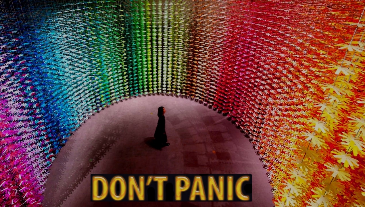
Choosing colors is an essential step in Website design, Logo design, anything design actually… Thoughtful Color Choice is going to pay off in the long run. Having good colors can make a huge difference in the fast online marketing environment.
This webpage is a tool is designed to help you decide what colors to use based on some general color Psychology and then help you communicate those choices into Nerd Terms that Graphic and Website designers need to actually digitize color. (Because for computers… there are about 100 variations of any color you could try to describe to us.)
Click on a color Below to REALLY see all of the options for what colors you can have on a website, flyer, logo… anything digital. Your design team is going to need the color codes that go with your choices. (you can just copy paste a list into an email)
Red
Aggressive, Important, Passionate
As a dominating color, red adds gravity and heightened awareness. The color increases blood circulation, breathing rates, and metabolism. Red can take on a variety of meaning, associated with both love and war, but the unifying factor in all meanings is a sense of importance. Think of the red carpet.
Orange
Energetic, Playful, Cheap
Orange has heat and energy… Like Red but safer! Orange is a good way to add excitement to a site without severity. It is generally playful, and some claim it plays on impulse and creates haste. It can even signify health, suggesting vitality and vibrance.
Yellow
Friendly, Happy, Warning
Yellow is an odd color: it is often associated with happiness, but it also activates the anxiety center of the brain. Like red and orange, it’s able to stimulate ~ Hence it’s use warning signs and taxis ~ but use harsh brighter yellows sparingly because of the potential negatives of being an eyesore.
Green
Natural, Stable, Prosperous
Green mostly represents outdoors and the environment, for obvious reasons, making it the clear choice to suggest nature and an organic quality. It’s also a popular choice as an accent or for calls-to-action because it stands out, but more softly than the warmer colors
Blue
Inviting, Trustworthy, Calm
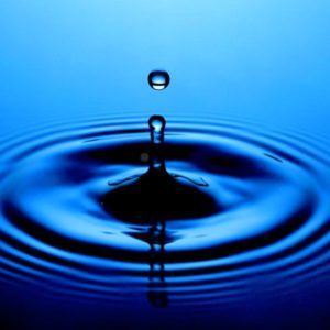
Blue is one of the most popular colors in web design ~ and for good reason! Its the color of trust. Blue evokes calm and serenity, and as such inspires a feeling of security. For this reason, blue is a color often used by banks: CitiBank, Chase, Capital One. But it’s still friendly enough for Facebook!
Purple
Luxurious, Mysterious, Regal
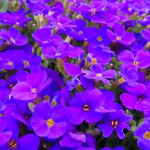
Historically associated with royalty, purple still creates an air of luxury, even decadence. Using a purple dominantly is a fast way to create a sense of elegance or high-end appeal, even if your product is budget-conscious (this “expensive” effect is definitely the opposite of orange).
Pink
Feminine, Innocent, Sweet
Pink is a specialized color that won’t work for a lot of sites, but will work beautifully with the right audience. Because most people interpret pink as feminine, the color is quite popular for targeting female users. Pink can also herald sugary treats and princesses.
Brown
Earthy, Sturdy, Rustic
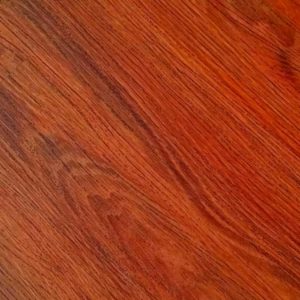
While not a popular choice in web design, brown can be effective nonetheless. As the color associated with the earth and trees, brown can provide an outdoorsy feel, maximized by pairing with green. In web design, brown is most often used in conjunction with wood texturing.
Gray
Neutral, Formal, Gloomy
As the intermediary between black and white, gray exudes neutrality, or a lack of any particular sensation. However, in the hands of an expert, this intermediary position can be a powerful tool to grab or repel attention. Dark or Light Grays can sharpen or dull the edges and space between elements.
